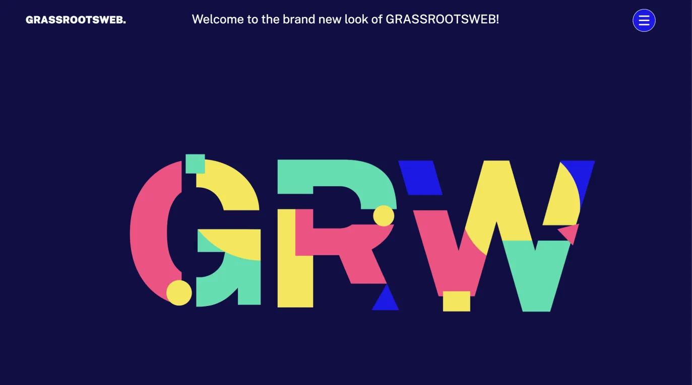
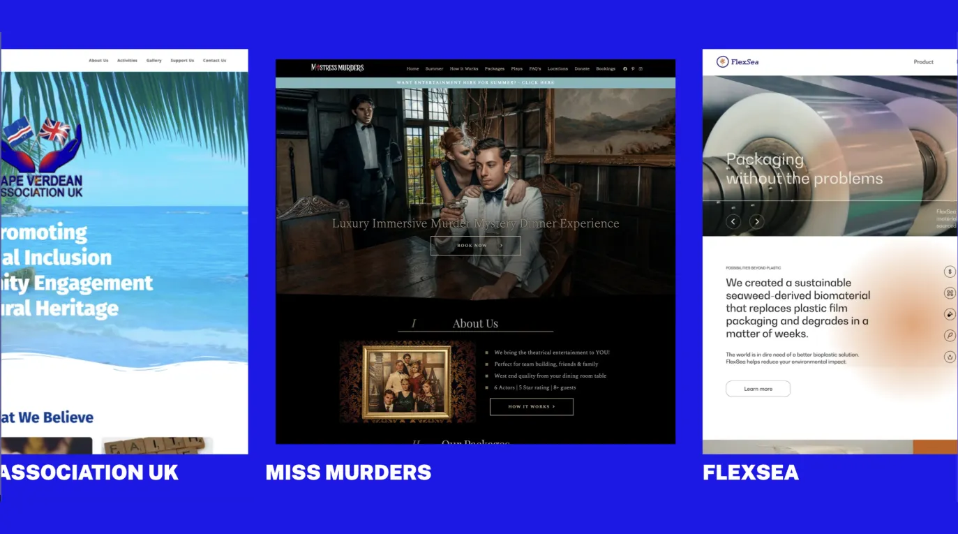
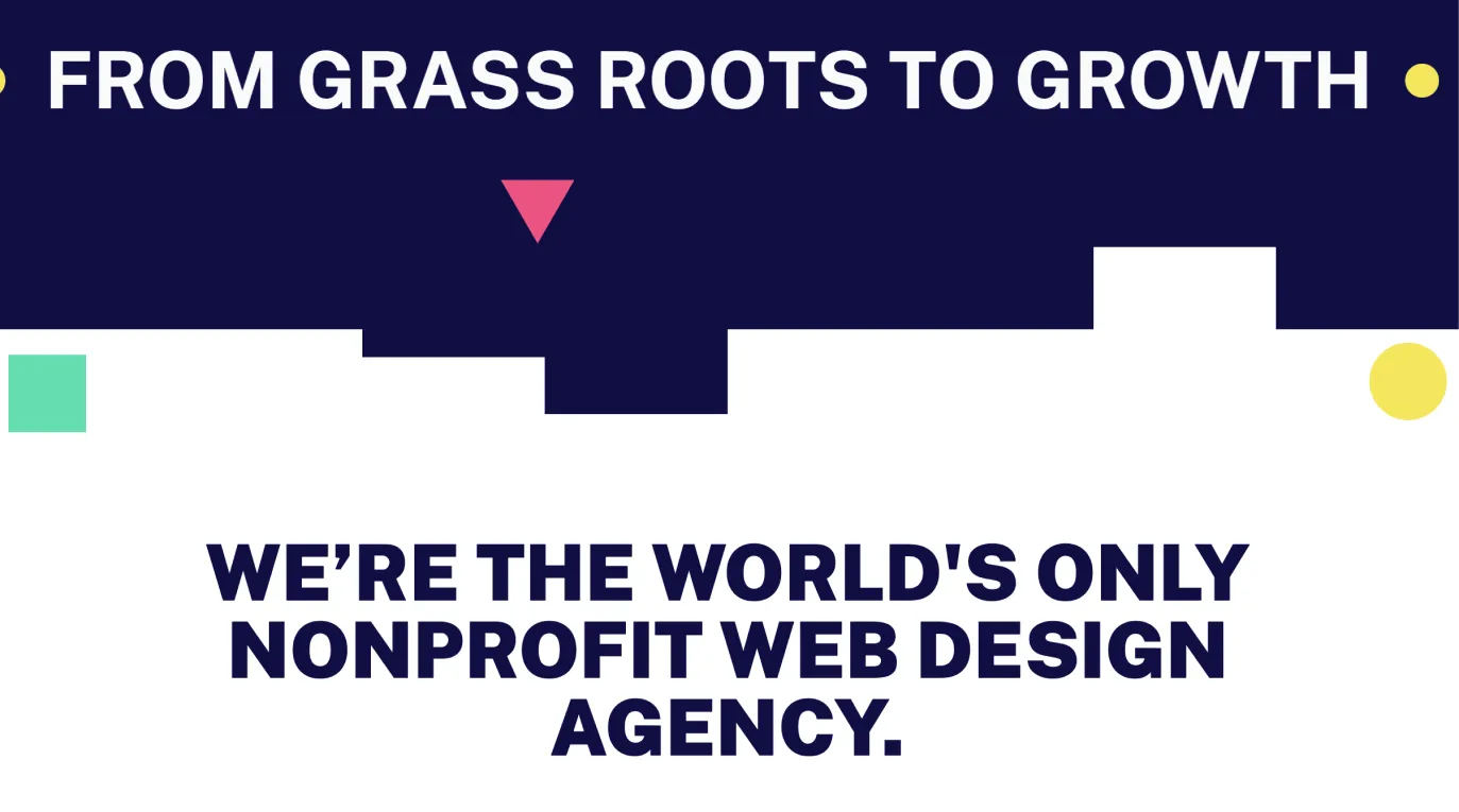
I led a full rebrand and Webflow rebuild for GRW, transforming their original 24-page WordPress site into a dynamic, accessible platform over four months.
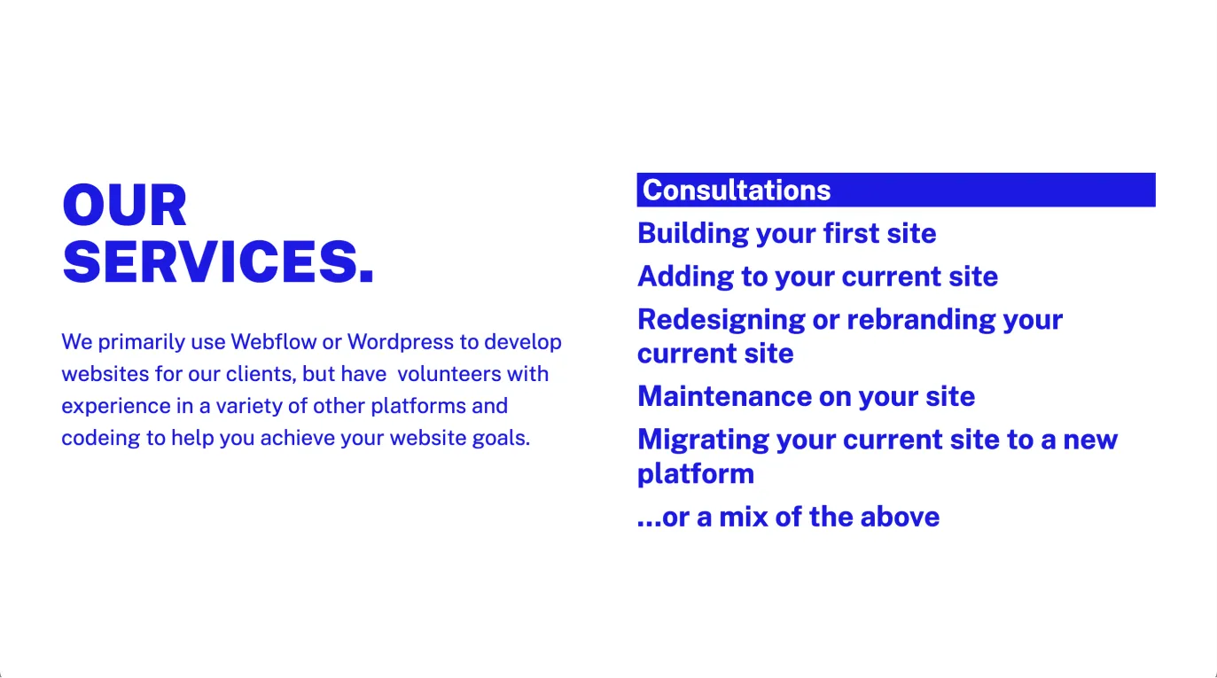
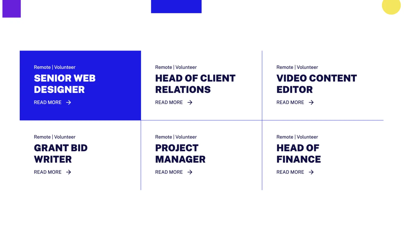
After a complete usability audit and competitor research, I developed a new visual identity—colorful, WCAG-compliant shapes and used it to guide the content strategy, information architecture, and design. To serve two distinct audiences, I differentiated sections and footers by color (blue for client-focused content, purple for volunteer-focused content) and designed custom CTAs for each group.
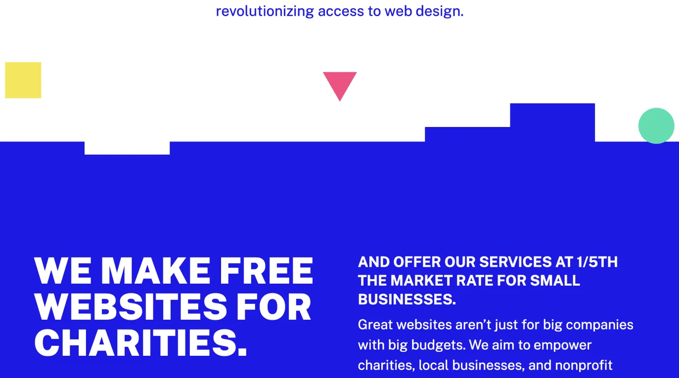
I built animated hero elements, responsive custom borders, and playful on-scroll interactions directly in Webflow using modular shapes rather than static graphics. Key pages highlight GRW’s mission, showcase services and case studies, and encourage volunteer sign-ups, while new templates streamline role descriptions and service details.
Working solo with a tight turnaround, I organized tasks carefully, held regular stakeholder reviews, and deepened my HTML/CSS/JS skills to deliver a robust, visually engaging site that clearly communicates GRW’s purpose and invites both clients and volunteers to connect.
There have since been some changes/updates to the site by the client.

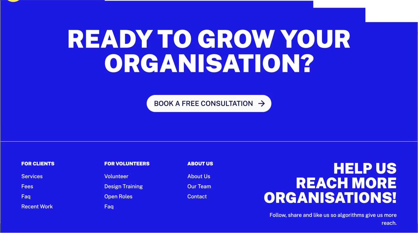
custom footer colors and CTA’s to encourage desired actions for each target audience segment - volunteers & clients